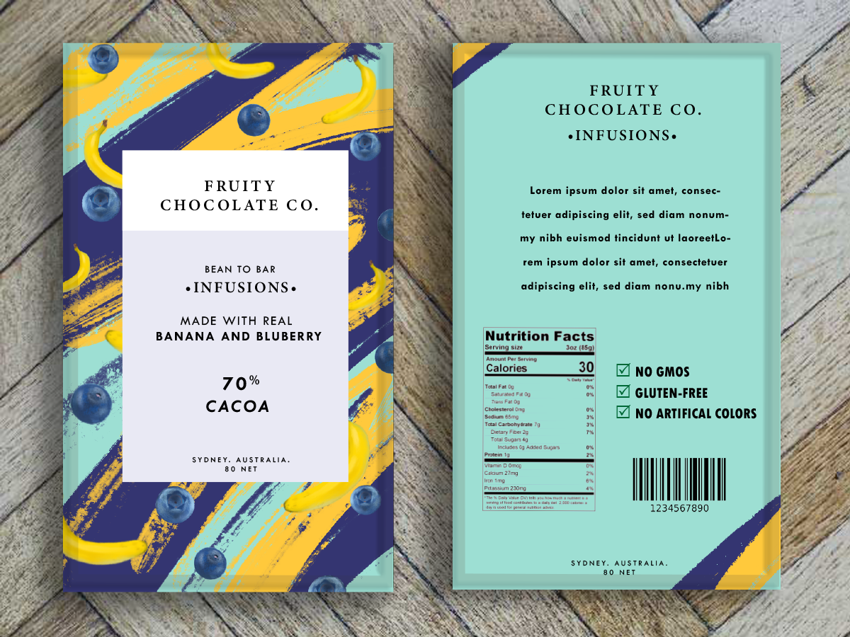


For this school assessment we were required to create a chocolate bar packaging design for Fruity Chocolate Co, a company that produces a range of handcrafted, fruit-flavoured chocolates.
For their new range of chocolates the company hopes to release, called “Infusions”. This range will feature a range of chocolate blocks. Each block will contain a surprising and delicious combination of two different types of fruit.
The designs are to match the personality of Infusions brand - that is the designs should be bold, fun and playful . The company wants the Infusions designs to stand out.
I wanted to create something that looks professional yet fun and creative. The duo coloured border I implemented was to add a nice contrast of colour. Which goes along nicely with a Serifs modern font for the company name and logo.
For the infusions logo I kept it simple and added in a black dot at the each end of the name. I was thinking less is more when it came to the font and logo since the background is already so detailed. For the background design I created fruits that have a oil painting feel to them on Procreate, scattered across. I added in the artistic paint strokes to not only fill in the empty space but it give it a unique, modern look. I made sure that the paint strokes colours match with the appropriate fruit colours to make it all cohesive.
Tasks for this assessment were:
• Finalise my three designs.
• Put these designs into a body of work.
• Verbally present this body of work to two members of Fruity Chocolate Co’s team.
•Create A logo for its new “Infusions” chocolate range.
• A flat rectangular design to appear on the front of the packaging for one of its new “Infusion” chocolate blocks called “B&B” .
•A flat rectangular design to appear on the front of the packaging for one of its new “Infusion” chocolate blocks called “S&L”.
• Process journal.
